
Unlike in the past when cellphones had physical buttons and a limited number of features, smartphones now offer a wide range of functions that we access by interacting with our devices’ touchscreens. However, using the same component that serves as the device’s viewing medium for the primary input tool can sometimes present difficulties for users.
This is where the device’s user interface (UI) comes into play, with the experience of the users in interacting with it referred to as the user experience (UX). In 2018, Samsung introduced an improved version of its standard user interface and software overlay called ‘One UI’.
As well as working to make them intuitive, consistent, and effective, UX designers try to base user interface interactions on the way we use physical objects in the wider world to promote familiarity. For example, users turn a digital page in an e-book just like they would a physical page, or slide their cards up in the Samsung Pay app in a way that mimics how they would remove a card from their wallet. But what do UX designers do when there is no way to base interactions on real-world actions? Samsung Newsroom sat down with the designers of One UI to find out.
An Interface to Help You Stay on Task
The concept of One UI started with the idea to try and help the busy users of today stay focused by simplifying their interactions with their smartphones. One UI designer Soeyoun Yim explained that the process of designing the interface was undertaken based on the concept of ‘everyday simplicity’, saying that, “One UI was designed to help users focus on important tasks by eliminating distractions.”
Now, One UI has been further developed into ‘One UI 2’, which was unveiled at the end of last year. This upgraded interface incorporates the icons from One UI in new styles and configurations, and includes revamped colors and movements. In addition, One UI 2 makes the icons more conspicuous with distinct color tones and motions, for instance when the ‘settings’ icon trembles to let users know that an update is underway.
‘Simplicity’ – to Help You Focus on What Matters
Simplicity was the number one priority for the designers when developing One UI 2. To that end, the pop-up screens that appear at the top and bottom of the screen were made more compact and simplistic to keep users from getting distracted while making use of features.
The camera app has also been simplified to ensure that the basic operation of the app isn’t impeded, and prevent users from getting distracted while they’re taking their picture. Taehee Hwang, the UX designer responsible for the camera app, outlined how this makes the user experience more straightforward. “The basic photo and video modes can be accessed at the bottom of the screen, while special modes such as the Food and Night modes can be accessed by selecting or swiping through to ‘More’,” she related. “This simplifies what is displayed on the screen so that users can concentrate on taking their picture.”
‘Comfort’ – So Your Eyes and Fingers Can Take It Easy
Making user interactions more comfortable and facilitating one-handed use were also at the fore of the development of One UI 2. Whereas One UI designated the top and bottom sections of the screen as the ‘viewing’ and ‘interaction’ areas respectively, One UI 2 allows the majority of tasks to be completed within the lower area of the screen. Moreover, for actions that require interaction in the top part of the screen, unnecessary finger movements were minimized to improve comfort and convenience.
The same principles were applied to the keyboard, making it possible for users to perform other tasks while keeping their fingers within the keyboard area. For example, by long-pressing the space bar, users can now control the position of the cursor from within the keyboard window without having to interact with the main text body. In addition, users can swipe left or right with two fingers to undo and redo actions, and adjust the dimensions of their keyboard to better match the size of their hands.
The ‘dark mode’ feature has been shown to reduce eyestrain, and One UI 2 has expanded the number of apps within which it can be applied. “Dark mode has been expanded to a number of apps that it wasn’t previously accessible in,” said Yim, “To make it more comfortable to use devices in the dark we are also applying a darkening filter to background wallpaper displays.” Yim also spoke to the designers’ efforts to further ease eyestrain, relating that, “An algorithm has been incorporated that analyzes the background image on the lock screen and automatically shows the time in the color that will show up best against that backdrop.”
‘Convenience’ – Streamlining Rich Experiences
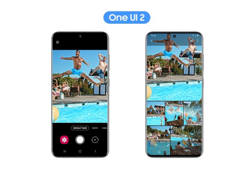
The ‘Single take’ feature comes with One UI 2 on the Galaxy S20 and is capable of using Ultra wide, Live focus, and short video features to deliver various photo styles and results, all with a single shot. “We started by asking ourselves two questions,” explained Hwang, “Firstly, how can we make sure the users enjoy the moment? And secondly, how can we deliver a variety of results without requiring the user to do more than take a simple, standard shot?”
While explaining what went into developing the feature, Hwang explained that, “Since this feature was to be introduced on the Galaxy S20, we decided that a help message should be displayed when the user entered Single take mode. Moreover, to allow the user to view a wide range of results simultaneously on the same screen we introduced a new kind of viewer.”
The video calling feature was also further upgraded with the integration of ‘Google Duo,’ Google’s simple, high-quality video calling app. Sueyeon Lee, the designer in charge of integrating Google Duo and One UI, elaborated on the designers’ efforts to improve convenience, saying, “Our goal was to make the user experience more convenient by making the features of Google Duo the default for Galaxy devices.”
Lee went on to highlight some other user experiences specific to Galaxy devices, remarking that, “5G video calls have been brought to smartphones for the first time with this integration, allowing users to experience FHD video calls and use AR emojis and wide screen mode within their video calls.” Lee finished by saying, “We will continue to develop advanced, integrated communication experiences linked to the phone, message and contact apps.”
The Galaxy Z Flip represents a totally new style of device with a revolutionary format. Thus, the question of how to provide top-tier usability and convenience on the new smartphone required the designers to think outside the box. Hyungwoo Shin, the designer responsible for developing the Galaxy Z Flip’s UI, outlined the development process, saying, “This is a whole new kind of device. We didn’t have access to any sample devices to which we could apply the new UI, so we had to print out screens, attach them to mock-up products and fold and unfold the devices to figure out how best to apply One UI.” In designing this special UI, the designers incorporated the ‘cover display’ aspect, which expands the interface onto the small screen on the outside of the phone that enables users to check the time, read notifications and take selfies when the phone is folded.
Special effort was put into developing the UI for the Galaxy Z Flip’s ‘Flex Mode,’ a feature that divides the screen into two halves when the phone is half-folded and set at a 90-degree angle. Shin explained how the design team catered to this unique form factor, saying that, “Designing a UI that would be suitable for a phone being used in Flex Mode presented a real challenge. We ended up creating a new layout that reflected the UIs seen on the foldable phones of the past.”
‘Accessibility’ – Fair and Available to Everyone
‘Accessibility’ means how easy to use and available a device’s features are to a wide range of users. The designers of One UI 2 worked to provide an equally accessible experience to everyone – regardless of age or disability – with features such as high contrast themes, which improve usability for visually impaired users. Samsung additionally consulted with differently-abled users to receive feedback on accessibility within the UI and to hear the users’ ideas on where there was room for improvement.
As a result, color adjustments and high-contrast features were implemented within the UI to expand usability to more differently-abled users. These changes also make it easier for users to access specialty features within the UI like Light Sensing, which detects nearby lights and informs the user of their status with vibrations, and Live Transcribe, which uses Bixby to transcribe audio messages and nearby noises.
One UI to Satisfy the Individual User
So, what’s next for the One UI design team? Since the first and second incarnations of One UI were about establishing the foundation of the interface, the next steps will focus on catering more to individual users. “Going forward, One UI will offer more customized content,” related Yim. “Active customization will be brought to bear to improve the individual user experience.”
As they continue their development work, the One UI designers will keep working to provide the best possible environment for Galaxy users, while ensuring that the interface is inclusive and makes inconvenience a thing of the past.
This article is written by Samsung


