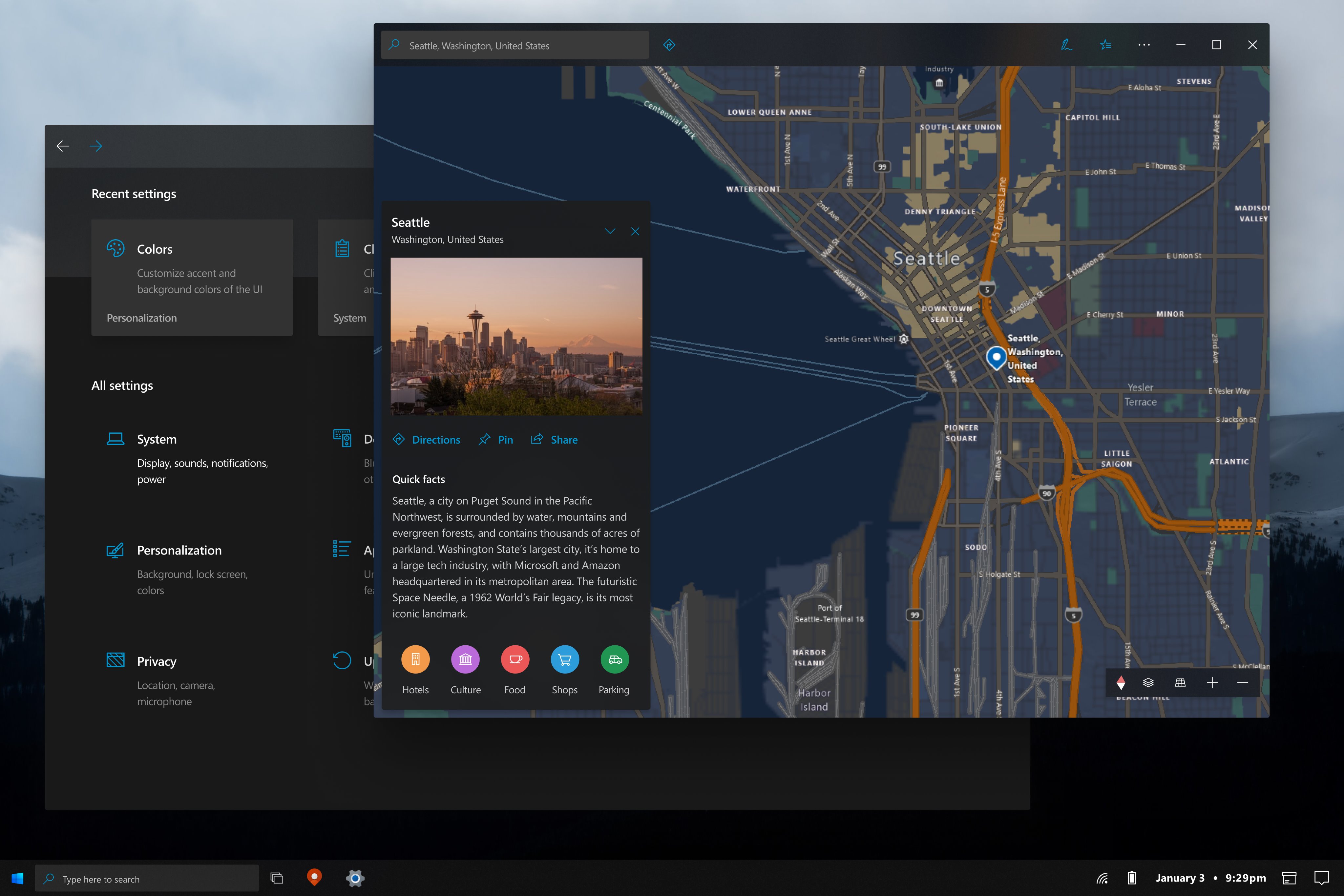
Windows 10X comes with a new design for the Start menu, and unsurprisingly, many users want Microsoft to bring it to full Windows 10 as well.
But while the software giant itself remains tight-lipped on the chances to see this happen, designers in the Windows community come up with more or less exciting ideas about how the Windows 10X Start menu could transform for a full Windows 10 version.
The concept that you see here, for example, uses Fluent Design in a more efficient manner than Microsoft, and needless to say, it makes the Start menu and the dark theme overall look stunning.
It goes without saying that the Start menu is inspired from the one in Windows 10X, but the dark design seems super-consistent in this concept and aligns with what so many users have previously requested in Windows 10.
Windows 10X and Surface Neo
Windows 10X is Microsoft’s dual-screen and foldable operating system which is projected to power Surface Neo. Officially announced last October, Windows 10X is likely to see daylight in the summer, as people with knowledge of the matter said its development is nearly complete.
Surface Neo, on the other hand, was originally projected to go live in the holiday of this year, but now it turns out that Microsoft could bring it to the market earlier than anticipated.
Windows 10X will feature both a dark mode and a light theme, just like Windows 10, but overall, the experience feels much more modern thanks to the redesigned Start menu, the new Action Center, and the other improvements here and there. How much of Windows 10X will migrate to Windows 10 is something that remains to be seen, but for now, all these concepts show that Microsoft’s new operating system is already successful despite not even launching.

https://platform.twitter.com/widgets.js
https://news.softpedia.com/news/this-windows-10-start-menu-does-fluent-design-better-than-microsoft-529434.shtml


