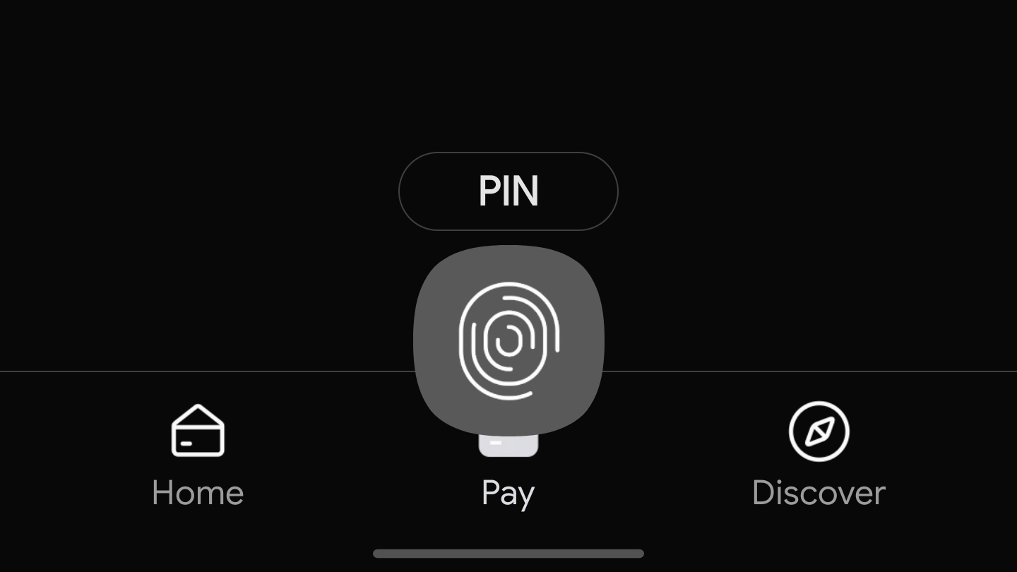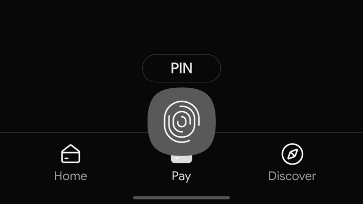
Samsung Pay is finally getting support for dark mode/theme, based on recent reports. Although it doesn’t seem to be rolling out widely just yet, a few folks have spotted the change live on their own devices, which switches the sometimes blinding black-on-white default to a nighttime friendly white-on-almost-black.
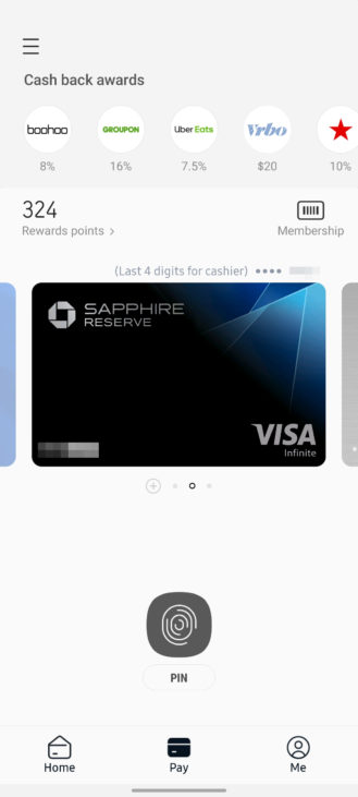
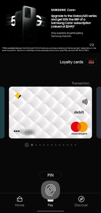
Left: Current light/default theme (on a Galaxy S20 Ultra). Right: Dark theme (on what we assume is a Galaxy S10 or Note10+). Some UI changes may be due to device differences.
The change may be tied to an app update, with two reports on Reddit claiming the feature is live on versions 3.9.88 and 3.9.97. None of our devices has either such a late version of the app or the dark theme/mode support just yet, but u/D0ncast3r on Reddit has documented more of the changes on his device:
It’s not quite the AMOLED black that some prefer, but it’s very close and matches Samsung’s other dark theme/mode implementations across OneUI 2.0. We aren’t sure if any other UI changes accompany this change, either. Again, it isn’t live for us just yet, but it is starting to roll out.
If we spot it rolling out more widely or manage to track down and verify a copy of the app that delivers the change, we’ll be sure to let you know.
https://www.androidpolice.com/2020/03/17/samsung-pay-getting-dark-mode-support/

