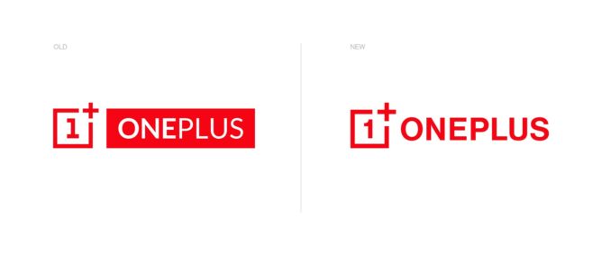
A couple of days ago, OnePlus CEO Pete Lau revealed that the company would be changing up its visual identity with some fresh branding and the new logo is now live. It might not be immediately obvious to you what’s new since it’s a very subtle adjustment, but the logo has been modernized while the typeface has also been updated.

If you look closely at the “1” within the logo, it’s now without the line at the bottom and the serif at the top exhibits a friendly curve. The plus sign is also larger and more prominent, while the typeface used for the logotype has been updated to match that which OnePlus has used on its most recent packaging. Both the company website and community forum now use the new lockup and we’ll see it rolled in various other places shortly.

It’s the most significant change to the OnePlus branding since the company started in 2013, and when you consider how similar the new logo is, it’s a testament to the sleek simplicity of the original design. The familiar red, black, and white color palette is getting a new teal hue for accents going forward, and the Never Settle tagline also uses the new typeface.
In a Weibo post, OnePlus also shared some stylized versions of the new logo with some snazzy designs to give us an idea of how it could be used more creatively (above and below). We can expect to see the new logo appear on the back of the upcoming OnePlus 8 Series phones, which are rumored to be announced on April 14. To celebrate the new brand identity, you can use the code “SAMEONEPLUS” to get $50/£50 off a OnePlus 7T from the official website. Many accessories are also discounted at present.
https://www.androidpolice.com/2020/03/18/oneplus-unveils-new-brand-visual-identity/


