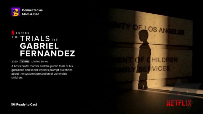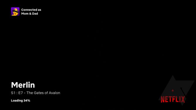
When you get home from work and fire up Netflix on the Chromecast tonight, you might notice that something’s a bit different today. The company is rolling out a new, and much more attractive interface for the entire Netflix-on-Chromecast experience, including a revamped ambient “Ready to Cast” screen and some tweaks to the loading screen and pause screen.

The “Ready to Cast” screen that shows once you connect the app to your Chromecast has a dramatically updated look. Instead of just staring at the company’s logo while you search for content to Cast from the app, now Netflix is actively promoting its shows and movies. A rotating selection of stills and accompanying descriptions will now be shown. Knowing Netflix, the content is probably even customized based on what it thinks you might want to watch.
The next time you connect to your Chromecast before choosing something to watch, now Netflix will offer a few recommendations. But that’s not all.

Above: Loading screen. Below: Pause screen.

The loading screen looks like it may have been tweaked slightly as well. Though we don’t have the old version to compare it with, the titles seem a bit bigger and bolder, and I’m not entirely sure if all the same information regarding seasons/episodes was shown before — or if it was, that it took this same formatting. The screen you see when pausing content picks up on the same cues, and it shows the Netflix logo now, just in case you forgot which service you were streaming from, I guess.

“Next Episode” also gets a slightly tweaked look.
The “Next Episode” notification you get as the 30s countdown starts is also a bit bigger and bolder to our eye, and the spacing for the timer that counts down seems slightly different as well.
The company hasn’t made an official announcement about this change, it’s probably too minor to merit it, but you should see it live the next time you fire up Netflix on your Chromecast. So far as we can tell, it has rolled out to everyone. And frankly, it’s lookin’ pretty good.
https://www.androidpolice.com/2020/02/26/netflix-gets-new-chromecast-ui-with-content-recommendations-and-more/


