Although Apple Mail has improved over the years, weak spots remain where the app could use further refinement. Notifications are one such inadequacy—iCloud and Outlook accounts notwithstanding, Mail won’t automatically push incoming messages to devices as they arrive, instead fetching them at infrequent, less convenient intervals.
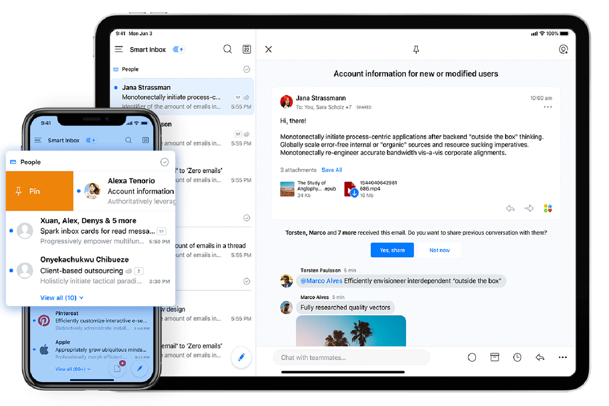
Push notifications for every email account is just one of many reasons to install Spark 2.5 on your iPhone, iPad, and Apple Watch. This free email client app helps stay focused on what’s important with the Smart Inbox feature, which intelligently gathers incoming messages from multiple accounts into a single view, categorizing them as personal, newsletter, or notification so emails from real human beings are placed front and center.
 Readdle
Smart Inbox offers a unified view of all email accounts and only the most important messages.
Likewise, Smart Notifications limit distracting alerts every time a retailer bombards an inbox with new deals, delivering only essential messages to devices. Viewing and working with email is equally satisfying, with the ability to snooze messages for a later date, schedule outgoing emails, receive follow-up reminders, and more.
 Readdle
Go ahead, embrace the dark side with Spark 2.5, even if your device isn’t running iOS 13.
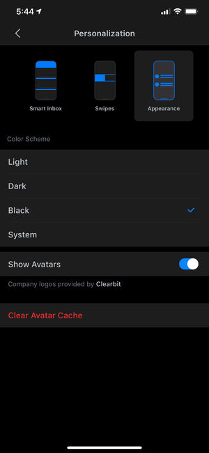
With the latest version, developer Readdle has given the slick user interface additional polish, putting emphasis on viewing email content while refining the appearance of threaded messages. There’s a new option to enable avatars, a feature we’ve long appreciated on macOS Mail to differentiate between senders when scrolling through a unified inbox. This feature works with existing contacts, as well as company logos provided by Clearbit.
Dark side
After debuting on macOS in late 2018, Spark for iOS finally adds Dark Mode, which works even on devices not running iOS 13. In addition to the system-wide setting, users can manually choose Light, Dark, or Black color schemes, with the latter delivering the kind of inky blackness that really pops on OLED screens built into iPhone X and later models.
iPad owners also have plenty to get excited about with support for multiple windows, so you can compose a new message while keeping tabs on the inbox, or reference earlier emails while sending a new reply. This is the kind of feature ideally suited for Spark, and the implementation here—especially in tandem with the floating keyboard—is nothing short of outstanding.
Last but not least, Spark for iOS offers additional customization, this time in the Email Viewer toolbar, which now displays up to six actions arranged in any order you’d like. Rather than drill into a popup menu to move a message, mark as spam, or save to PDF, all that’s required is a single tap on a button at the bottom of the screen. This is the kind of time saving feature we love, which comes in especially handy for evicting unwanted messages to junk mail.
 <small…
https://www.macworld.com/article/3512023/spark-for-ios-review.html#tk.rss_all


