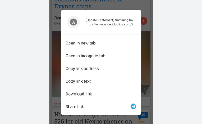

Google Chrome 78 has been rolling out to the stable channel over the last few days, and among improvements to local file management and automatic verification SMS pasting, we keep finding changes here and there. One of these is a redesigned context menu that flies towards you with a spiffy new animation when you long-press a link, image, or video. It has been available as a flag in one form or another for more than two years, but Chrome 78 seems to have activated it for most people.

The new menu opens with an animation that makes it look like it expands from the link you long pressed, which makes sense and feels more natural than the previous context-free fade-in. The card has grown slightly taller and lost some of its width. The items in it remain mostly the same except for two notable changes: Instead of showing the full URL, the menu now previews the title, logo, and displays only part of the link. Sending links to others got easier, as the app you last used for sharing has been added next to the Share link entry.


Left: The old context menu. Right: The new menu in Chrome 78.
The long-press menu for images has seen a similar revamp. There’s a little thumbnail previewing the content at the top, and image-specific options have been separated from URL-specific options by a line if the picture you’ve tapped is also a link. Video menus have seen this treatment, too, though they only show a camera icon instead of a thumbnail up top.
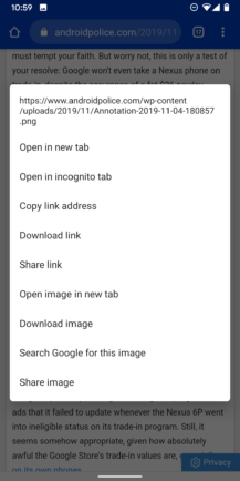


Left: The old image menu looked convoluted when it also involved a link. Middle: A separator makes options much easier to parse at a glance. Right: Image menu when it’s not hyperlinked.
If the new interface doesn’t show up for you yet, simply head to chrome://flags and search for enable revamped context menu. Activate this flag, and you can start using the menu after restarting your browser. The same is true if you don’t like the design — just deactivate the flag.
You can download the latest version of Google Chrome from the Play Store or from APK Mirror.
- Thanks:
- Manu,
- Em kay,
- Nicola
<
