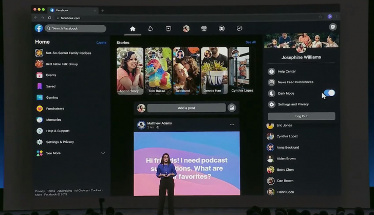
Back at F8 2019, Facebook promised a redesign for its mobile apps and website. The Android app started receiving the new interface almost immediately, but the change was only promised on the web in “the next few months.” Now, it’s starting to roll out and along with it comes a new dark mode option.
For the past few days, many users have reported that they got prompted by Facebook to try out the new interface. After accepting, they get asked if they’d like to use the white or dark layout. The choice is also available under the quick settings accessible from the top right avatar.
Image credit: @teepusahab, @kimsantoshansen
Of course, the new design isn’t universally liked, and it even has issues with text readability in a few dark mode screens. But that’s the price of any early release.
If you don’t get prompted by Facebook’s website to try the new look, there doesn’t seem to be any workaround to force-trigger it just yet.
https://platform.twitter.com/widgets.js
https://www.androidpolice.com/2019/10/20/facebooks-new-web-interface-is-rolling-out-for-some-with-dark-mode-in-tow/


