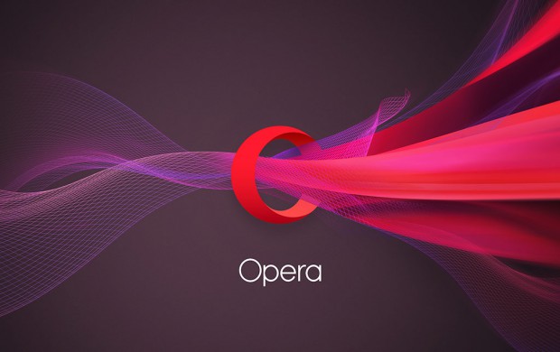
Today, we’re unveiling our new brand identity. We’re introducing a new look and feel. But, it’s more than just a logo shift.

Opera has evolved a lot since we started our journey as a browser company 20 years ago. Today, we serve over a billion internet users every month, between the 350 million people around the world experiencing the internet through our apps and services and the 1.1 billion people we reach through Opera Mediaworks.
It’s time for a consistent brand identity that reflects what Opera is about:
We want to enable more people, in more places, to experience what matters, when it matters most.
[See the video of revealing the new branding: https://youtu.be/KvJJk5Z-iZE]
Do more with the new “O”
The cornerstone of Opera’s new brand identity is our redesigned logo. It still preserves the good ol’, familiar red “O”. But, just as our products are about more than technology, the new logo stands for more than the first letter of our company name.
We envision Opera’s new logo as a portal quickly connecting you with what you’re looking for on the web. The 3-dimensional “O” symbolizes a gateway that leads you to more: more content, more discoveries, more answers, more communication, more fun, more data savings, more of life – whatever you seek online, Opera helps you do more!
From “Opera Software” to “Opera”
With the extended Opera family and our ever-expanding range of products and services, we feel we’ve grown beyond the bounds of a software company. Today, we see Opera more as an internet company providing great experiences online. To reflect this, we have dropped the “Software” from our logo.
How we worked on it
A new brand identity is more complex than colors, icons and fonts. It is a system that unites the goals, the products and the history in an easy-to-communicate way.
Building that system has involved a tight collaboration between Opera’s in-house creative team and two independent agencies – U.K.-based DixonBaxi, who helped us define the global brand and creative strategy, and Anti from Norway, who worked with us on the visual identity. It’s been an intense, exciting journey lasting about a year.
The new “O” first rolls out on mobile phones
Today, we’re revealing the new identity and updated icon for our flagship product Opera Mini on the iOS platform. Our subsidiary mobile-advertising company Opera Mediaworks is also launching a fresh, new look.
Opera never stands still, so it was really important for us to make our new brand something that could endure and grow with us. We have new solutions and products in the pipeline, and we want them fit into the new identity organically.
Over the next few months, we’ll be rolling out the new brand across the Opera family, including our entire product portfolio. Opera for Android, Opera Mini for Android and Opera for computers are next in line for the change, within the next few release cycles. Soon afterwards, we’ll revamp the icons and logos for of our data-management app Opera Max, the Opera Coast browser for iOS and our other apps. Stay tuned!
In the meantime, you can bring the new Opera brand onto your device with this wallpaper:
http://blogs.opera.com/news/wp-content/uploads/sites/2/2015/09/opera-new-logo-brand-identity-portal-to-web.jpg


